Table of Contents
Overview
This document outlines the use of the Timeline feature of Autopsy. This feature was funded by DHS S&T to help provide free and open source digital forensics tools to law enforcement. The timeline feature can help answer questions such as these:
- When did major web activity occur on a system?
- When were external devices plugged into the system?
- When were pictures with EXIF information added?
- What websites were accessed that resulted in file system modifications immediately after?
Note that as of Autopsy 4.13, timeline events are now generated during ingest and stored in the case database instead of a separate database. For this reason, older cases will not longer work with timeline.
Quick Start
Use this section to learn the basics of timeline. More details on the display options can be found later in this document.
First you'll need to have a case open in Autopsy. To get the most out of timeline, you'll want to do the following during ingest:
- Enable the hash lookup module and use the NSRL to ignore known files
- Enable the recent activity module to generate web-related events and other miscellaneous event types
- Enable the Picture Analyzer Module to generate events on when images were
- Enable other ingest modules that apply to your data. If you have email data, ensure the email parser module is enabled. If you are analyzing mobile devices, ensure the Android analyzer module and any other relevant modules are enabled.
To open timeline, either use the "Timeline" button or navigate to "Tools" then "Timeline" in the menu. You can open timeline while an image is processing but the data will not be complete until it finishes. Timeline will start in counts view with a chart showing the number of events in each time period.
You can click on one of the segments of the graphs to see the list of events in the lower left. Clicking on a single event will display details in the lower right section.
You can change the view mode using the buttons in the upper middle area of the window. The second view mode, details view, shows information on events that happened in a specific time period. This mode is best used after filtering down to a small window of time.
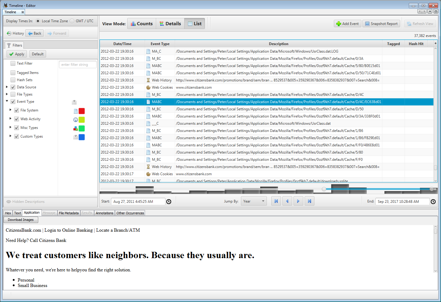
The final view mode is the list view. This view shows every event in the order it occurred. This can be helpful to see which other events happened in the same time frame as an event of interest. As with the details mode, this mode is best used with filters to reduce the number events shown.
Basic Concepts
This section covers some basic concepts of the interface.
Events
The timeline tool is organized around events. An Event has a timestamp, a type, and a description. Note: all Events are discrete, but might be grouped together to form clusters with a duration in the Details View depending on the level of Description that is enabled in the UI.
The timeline collects data from multiple sources and organizes the events into the following taxonomy:
- File System
- Modified
- Access
- Created
- Changed
- Web Activity
- Web Downloads
- Web Cookies
- Web Bookmarks (creation)
- Web History
- Web Searches
- Web Form Auto Fill
- Web Form Address
- Miscellaneous
- Messages
- GPS Routes
- Location History
- Calls
- Recent Documents
- Installed Programs
- Exif metadata
- Devices Attached
- Log Entry
- Registry
Visualization Types
There are three different graph types that the Autopsy viewer provides. Each is better suited for a different type of question that the investigator is trying to answer. You can change between the three types in top part of the interface.
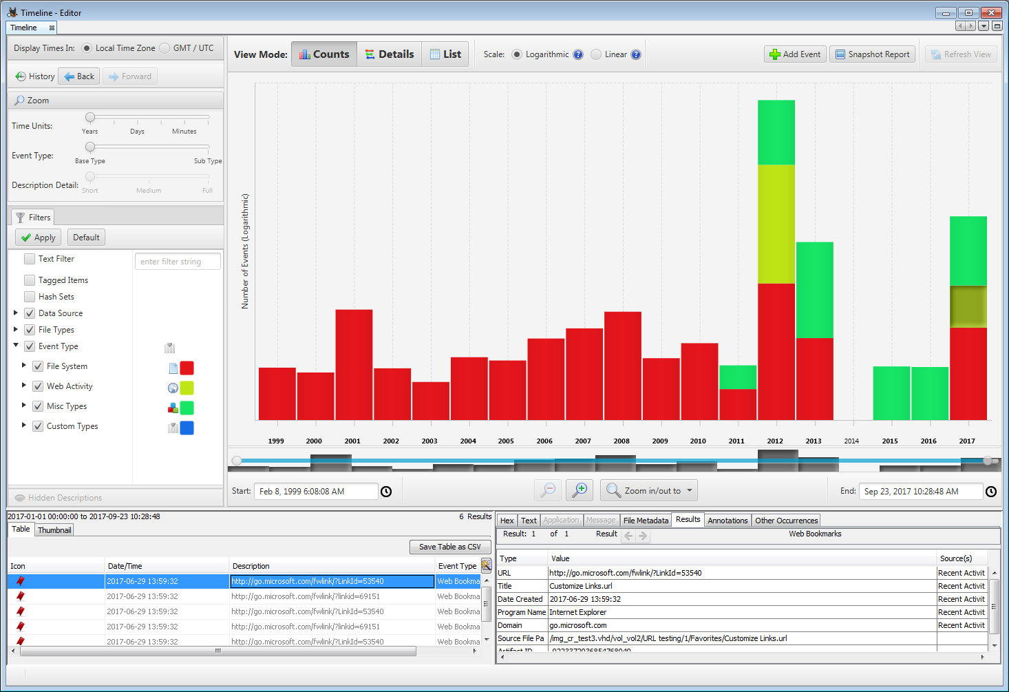
The Counts View shows a stacked bar chart. Use this type of graph to show how much activity occurred in a given time frame. It won’t show you specific events though. It can be helpful to determine when the computer was last used or how often it was used. When you open a timeline, it will open in this style of graph.
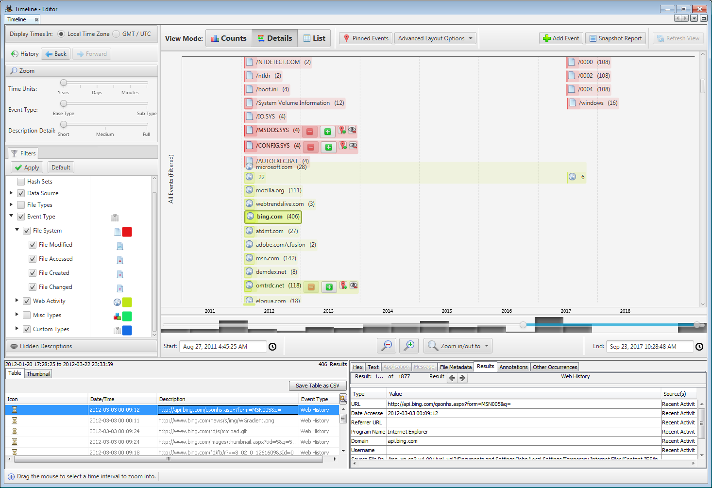
The Details View shows individual or groups of related events. Date/time is represented horizontally along the x-axis, but the vertical axis does not represent any specific units. You would use this interface to answer questions about what specific events happened in a given time frame or what events occurred before or after a given event. You would generally use this type of interface after using the Counts View to identify a period of time that you wanted details on. There can be a lot of details in this view and we have introduced zooming concepts, as described in the next section, to help with this.
The List View shows all events in the order they occurred. This can be useful for knowing what happened before and after a certain event. For example, if you have a web download, you can find out other files that were created before or after that. The list view can be over whelming because there can be thousands of events in any given time range. Use the filters described below to bring the number of events down to a relevant size.
The table on the bottom left hand side of the panel has a UI Quick Search feature which can be used to quickly find a node in the table.
Visualization settings
The toolbar above the visualization area shows settings specific to the active visualization. These settings affect the way events are displayed and/or the layout of the visualization.
Zooming
A common challenge with timeline analysis is information overload. To help with this, the Autopsy interface has three ways of zooming that will help you identify the correct data. These can be controlled from a single area in the upper left of the interface.
- Time Units: This level of zooming controls the temporal detail shown on the X-axis. It dictates if there will be markers at the scale of years or seconds. As you want more details about what happened in a given time range, you will zoom in more with this control.
- Event Type: This level of zooming controls what level of event type you see. As an example, there is a top-level type of “File System” event with sub-types for modified times, accessed times, and created times. If you want more details about a given type, then you will zoom in more with this control.
- Description Detail: This level of zooming is most unique to Autopsy and groups similar events together based on their description. As an example, it will group file system events together if they are in the same root folder when you are zoomed all of the way out. This allows you to generally see where there is activity without seeing each individual file.
For the quick start approach to things, you should keep this in mind: Double clicking on something will change only one of these levels of zooming. We have tried to choose what would be most intuitive for most use cases. If you want to choose a different zooming approach, use the sliders in the upper left or right click on the chart.
History
If at any time you want to back out to something you saw before, use the back and forward history buttons in the upper left , or the keyboard shortcut Alt + Left/Right.
Timeline Interaction and Configuration Details
Filters / Events
This area allows the user to apply filters to limit what events are shown in the visualization. When the Details View is active, a tab in this area also enables navigating the visualization by event descriptions ( see the Details View section for more on this)
When the Hide Known Files filter is active, files with known hashes will not be included in any way in the rest of the timeline tool (except for the Histogram which shows all events). In order for this filter to work, the Hash Lookup ingest module must have been run with a Known hash set enabled.
When the Text Filter is active, only events with descriptions containing the supplied string as a substring will be shown. Note: this filter users the full description in its search even if not displayed.
The Event Types filter allows the user to select which event types should be shown. Right clicking an event type brings up a context menu with options to select different sets of types.
The Event Type hierarchy displayed in the filter tab also functions as the legend for the visualizations. Events are color-coded to match their type, and have the corresponding icon displayed in several places.
Time Range Selection
The time range selection area provides several means of adjusting the displayed time range. Date/Time fields show the exact date and time of the start(left) and end(right) of the displayed range. The user can type directly into these fields or use a graphical date/time chooser to modify the start or end time. The minus and plus hour glass buttons(/) zoom the visible time range out and in a set percentage. The drop down menu to the right allows selecting a preset time range. These methods will adjust the visible time range around its center. The last method to adjust the visible time range is via the range slider. The user can position each end independently to adjust the start and end time respectively or drag the highlighted blue section to move the visible range without changing its length. In both visualizations, the user can also right-drag (starting in empty space) a time span, represented by a pale blue box, and then double click it to zoom the visible time range. Right clicking the blue time span box clears it.
Histogram
Behind the time range slider is a histogram of all events in the case. The histogram can help to put the main visualization in perspective by showing a high level summary of all events in the case, with a representation of the visible time range superimposed via the time range slider. The histogram divides the entire time span of all events in the case into equal intervals and shows the number of events in each interval via the height of the corresponding bar. The histogram should only be used for relative comparison and context and not for determining exact numbers or times of events. Note: This histogram is not affected by filters or zooming.
Time Zone
The user can choose between viewing events in their local time zone or in Universal Coordinated Time.
Visualization Area: Counts View
The Counts View shows a stacked bar chart with time periods along the x-axis and event counts along the y-axis. The height of each bar represents the number of events that occurred in that time period. The different colored segments represent different event types. Right clicking the bars brings up a context menu with selection and zooming actions.
The only setting specific to the Counts View is what kind of vertical scale to use: The linear scale is good for many use cases. When this scale is selected, the height of the bars represents the counts in a linear, one-to-one fashion, and the y-axis is labeled with values. When the range of values is very large, time periods with low counts may have a bar that is too small to see. To help the user detect this, the labels for date ranges with events are bold. To see bars that are too small, there are three options: adjust the window size so that the visualization area has more vertical space, adjust the time range shown so that time periods with larger bars are excluded, or adjust the scale setting to logarithmic.
The logarithmic scale represents the number of events in a non-linear way that compresses the difference between large and small numbers. Note that even with the logarithmic scale, an extremely large difference in counts may still produce bars too small to see. In this case the only option may be to filter events to reduce the difference in counts. NOTE: Because the logarithmic scale is applied to each event type separately, the meaning of the height of the combined bar is not intuitive, and to emphasize this, no labels are shown on the y-axis with the logarithmic scale. The logarithmic scale should be used to quickly compare the counts across time within a type, or across types for one time period, but not both. The actual counts (available in tooltips or the result viewer) should be used for absolute comparisons. Use the logarithmic scale with care.
Visualization Area: Details View
The Details View shows events clustered by their description. Date/time is represented horizontally along the x-axis, but the vertical axis does not represent anything and is only used as a space to layout overlapping events. Events with the same type and description that occur close together in time may be clustered together. The Time Unit, Event Type and Description Detail sliders control how events are clustered. When the Description Detail level is at full, it is likely that very few events will be clustered, resulting in an enormous amount of detail being displayed. This can cause significant UI lag, and so it is not recommended to use the full description unless the time range has been narrowed and/or filters applied to reduced the number of events shown. Projections of the selected clusters are displayed on the x-axis to help visualize the temporal relationships between them.
The Details View has four settings that affect the visible information and the layout of the event clusters. The four settings are independent and can be combined to achieve a variety of effects with different densities of information and layout patterns.
Band by Type: If Band by type is not selected, all the event clusters of different types will be intermixed, in a compact layout. If Band by Type is selected, each event type will have a horizontal band reserved for it and events of different types will not be intermixed. Band by Type is useful when the user wants to compare events of the same type primarily.
One event per Row: If one event per row is selected no event clusters will ever overlap vertically, this will make the visualization more like a Gantt chart but uses much more vertical space.
Truncate Descriptions: The user can select ‘truncate descriptions’ and choose a length (in pixels) to truncate the text label shown with each cluster. This is useful if the descriptions are long and preventing a compact layout.
Description Visibility: The user may choose a description visibility level of ‘show’, ‘counts only’, or ‘hide’. Show is the default. If Counts only is selected, only the count in parenthesis is shown, if hide is selected the entire text label is hidden. Counts only and hide are useful if the user wants to get a less cluttered view, focussed more on when event clusters occurred and their type, and is not interested in the descriptions.
Clicking the small green [+] button in a cluster will expand it with the next level of detail. The events in the cluster will be displayed clustered at a time scale appropriate for their extent and the detail level chosen. This can be repeated for the subclusters, to create a nested hierarchy of clusters. Clicking the red [-] button collapses a cluster to a lower level of detail. As with the global description level, care should be used when fully expanding large clusters, as this may cause an enormous amount of detail to be shown, slowing the tool down.
Visualization Area: List View
The List View shows all of the events in your selected time range. You can control this time range using the "Start" and "End" entries below the list, or by moving the endpoints of the blue line that is is displayed over the bar graph under the list. Selecting an event in the list will display its details in the bottom section of the screen.